[RUN]it - BRANDING, BRANDING, BRANDING (pt.I)
[RUN]it - BRANDING, BRANDING, BRANDING (pt.I)
We are STIMVAULT...
Over the last while we have been toying with ideas for our studio logo for our official release. We knew we wanted the logo to be simple and instantly recognisable, with a dedicated font that would stand out and a logo that can be subtracted from the font but be easily recognisable as our own.
Our main inspiration for the logo was in our research into other logos from not only the game industry, but also from other industries such as the tech industry, tobacco, motoring, and other consumer products. Image is everything, and we look to take that on board when dealing with our branding across the board.
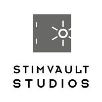
"STIMVAULT STUDIOS" actually came about during the development of our first game, [RUN]it, and is an amalgamation of the terms "stim" - meaning stimulant, which was a mechanic we initially thought of adding to the game, and "vault" which was initially what we called the airlocks in the game. It also aligns with our studio's mission: To provide our player base with a vault full of stimulating, action-packed games!
The idea behind the logo is that the text and the Vault symbol can coexist in one image, but both also have the ability to exist individually and still signify our company.
These will inevitably be tweaked over time but currently, this is what we are happy with as it ticks all the necessary boxes.
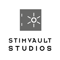
Attached are two variations of the logo to be used in all social and corporate branding.
Catch you in the next one...
- [RUN]it Team
Get [Run] It
[Run] It
A fast-paced, action-packed parkour game with a high skill ceiling
| Status | In development |
| Author | StimVault Studios |
| Genre | Action, Adventure |
| Tags | Action-Adventure, freerunning, Low-poly, Parkour, Singleplayer, skill-based, Speedrun |
More posts
- [RUN]it - ART UPDATEDec 19, 2020
- [RUN]it - MARKETING AND PRDec 19, 2020
- [RUN]it - BRANDING, BRANDING, BRANDING (pt.II)Dec 19, 2020
- [RUN]it - POST-PLAYTEST CHANGESDec 18, 2020
- [RUN]it - TECH OVERVIEW (so far...)Oct 30, 2020
- [RUN]it - THE SIMULATIONOct 29, 2020
- [RUN]it - THE STORY BEGINSOct 28, 2020
- [RUN]it - INTRODUCTIONOct 25, 2020
Leave a comment
Log in with itch.io to leave a comment.